A few days ago, I received a message from a friend in Maryland who works for the county government.
“Does lockdown work?” She asked, knowing I was in Spain, where we went into lockdown just over three weeks ago. Constituents were asking this very question of the elected officials with whom my friend works. People were concerned that lockdown would only hurt business while not providing enough protection. Given the poor numbers coming out of Spain and Italy at the time, shoddy journalism and the flood of out-of-staters from heavily infected areas flooding their county, this question seemed reasonable given that hundreds of epidemiologists have explained how stay-at-home orders work to “Flatten the Curve.”
Since then, the jurisdiction where she works has issued executive orders banning short-term rentals (28 days or less) for hotels, motels, houses, etc. to discourage the out-of-towners. A neighboring state has also made it a primary offense for individuals with out-of-state license plates to travel anywhere except state/federal highways. Unless the driver has essential business, he or she can be will be turned back.
Those are all good measures, because for lockdown to work, people have to stay home! And understandably, when no one around you seems sick, it’s hard to fathom that staying home and doing nothing, inaction, that is, is the action that accomplishes the goal of reducing transmission.
But the fact that my friend, who is wildly intelligent, didn’t know how to answer this question made me want to put together this post for her, and anyone else who wants to understand which numbers to look at to measure success. Given how fast and furious information about potential vaccines and treatments is flying around, I’ll conclude with some thoughts on the scientific process so that readers understand why Dr. Fauci is reluctant to recommend treatment with anti-malarial drugs based on only a few studies.
Quick disclaimer: I’m not an epidemiologist, a statistician, a doctor, nor do I have a degree in Public Health. I’m not even an armchair or quack epidemiologist.
Quick credentials: I have a masters degree in science, a fundamental understanding of how the scientific process works and a basic knowledge of statistics. I worked for years analyzing scientific reports , evaluating whether claims made by researchers lined up with their data. I also teach science writing and in my course, we explore how scientific knowledge is created.
I’m also a writer, so let’s start by deconstructing the shoddy journalism that encourages clicks but doesn’t help the reader understand which numbers to look at when. Such as this opening from a recent article in the local press in the Basque Country:
“Since the first cases of COVID-19 were diagnosed in Spain, two months ago, the curve of total numbers of infected people keeps growing. The daily graphs show an exponential increase in cases, which even though are moderating, don’t give up.” (El Diario Vasco)
I could spend the whole post tearing this apart, but let’s be brief: Of course the total number of cases is growing. Every day that new people get infected, the total number of cases grows. No one is being removed from this total, so this number will never shrink. Never. It is always going to go up. Someday–someday, it might not grow, but that is not in our near future.
So stop looking at this number to alleviate your anxiety. It tells you about the spread of the virus, but should not be the measure to use to evaluate if lockdown works. This number is always going to grow worldwide, until there is a vaccine or cure.
Admittedly, these numbers are scary, which is why the press loves them. Drama sells, and drives clicks. And these numbers are useful to understand the spread of the virus.
But that’s not what we’re doing here. We’re trying to understand what numbers to look at during lockdown.
During lockdown, the point is to slow the spread of the virus, to reduce transmission, so a more effective number to looks at is the rate of increase in the new cases. That is, is the total number of cases growing by more each day, the same, or less. As transmission gets reduced in a community, the number of new cases will start to decrease.
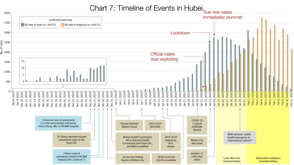
Now, to understand why this takes three-four weeks, let’s look at this article from Medium, by Tomas Pueyo. It’s the best article I’ve read that explains in words and charts how the process of lockdown actually works. If you don’t have time or inclination to read the whole article, just look at this chart.
According to Pueyo:
“Orange bars are the daily official number of cases in the Hubei province: How many people were diagnosed that day. The grey bars show the true daily coronavirus cases. The Chinese CDC found these by asking patients during the diagnostic when their symptoms started.
Crucially, these true cases weren’t known at the time. We can only figure them out looking backwards: The authorities don’t know that somebody just started having symptoms. They know when somebody goes to the doctor and gets diagnosed.
What this means is that the orange bars show you what authorities knew, and the grey ones what was really happening. On January 21st, the number of new diagnosed cases (orange) is exploding: there are around 100 new cases. In reality, there were 1,500 new cases that day, growing exponentially. But the authorities didn’t know that. What they knew was that suddenly there were 100 new cases of this new illness.Two days later, authorities shut down Wuhan. At that point, the number of diagnosed daily new cases was ~400.
Note that number: they made a decision to close the city with just 400 new cases in a day. In reality, there were 2,500 new cases that day, but they didn’t know that. The day after, another 15 cities in Hubei shut down. Up until Jan 23rd, when Wuhan closes, you can look at the grey graph: it’s growing exponentially. True cases were exploding. As soon as Wuhan shuts down, cases slow down. On Jan 24th, when another 15 cities shut down, the number of true cases (again, grey) grinds to a halt. Two days later, the maximum number of true cases was reached, and it has gone down ever since.Note that the orange (official) cases were still growing exponentially: For 12 more days, it looked like this thing was still exploding. But it wasn’t. It’s just that the cases were getting stronger symptoms and going to the doctor more, and the system to identify them was stronger.
In other words, thanks to good data collection by the Chinese on symptom appearance, once officials knew how many people were infected on a given day, they were able to go back and plot the actual number of cases on those days, in the past, on the days before those cases had been identified.
When you backtrack to see how many people were infected before they knew they were infected, this shows you the true spread of the infection before and during lockdown. The key message here is that at least in Wuhan, the day they locked down, actual new cases started to decrease, a trend that couldn’t be seen until afterwards, because of the lag time between infection and symptoms/testing.
Hopefully this helps to make clear that following this model, lockdown starts working almost immediately, even if there are no numbers at the time that bear this out. When you add on to that the fact that the most severely ill can take three -four weeks to die after infection, it becomes clear why the death rates have a lag time of a week or two behind new infection cases. That is, infection rates should start to decrease before death rates, because of the timing difference.
This data from China is very clean, almost too clean, in that the actual peak was reached almost two weeks to the day following lockdown. Then again, Wuhan underwent a complete lockdown, far more severe than restrictions placed in Spain and Italy.
Given that, it’s not surprising to see that in both Spain and Italy the peak is more of a plateau, and that it’s taking closer to three weeks to traverse this plateau and begin a descent, that also looks to be plateauing, rather than steeply dropping. I’m unable to load the graphs of daily new cases in Spain and Italy, but if you look in the links above at the number of new cases, and draw an imaginary line across the top of the bars, that’s exactly what’s happening.
So, to return to the original question, does lockdown work?
The answer seems to be yes, but keeping in mind the following caveats as you try to answer this in your own community:
- Total numbers of new cases are always going to vary based on how many tests are given and how each jurisdiction decides who is getting tested. If this changes from day to day, it can impact the trend. So look at the change in number of new cases, but understand that even this is not a perfect measure.
- In any scientific process, there is always noise in the numbers. That is, if you see the numbers go down for four days, and then up again for a day, it doesn’t mean the trend has changed. Any one of many things could cause that variation. It’s important to look at the overall trend, which is why they call it the curve, NOT the point. So when the press reports something like “Numbers rise again after four days of decrease,” this should not be cause for alarm if the overall trend stays the same. It may sell papers or enhance clicks, but it’s not good science reporting.
Because of these variations in testing, in Spain, and now New York, I believe, other indicators are also being used to measure progress:
- The increase/decrease in number of hospitalizations
- The number of patients admitted to the ICUs**
Again, these numbers are not perfect since the criteria for admission may change over time as new hospital beds are set up, but ICU admission criteria is pretty consistent. When ICU admissions start to decrease, that should be a sign that the number of infections is also decreasing. Total numbers of patients in the ICU can also be an indicator that the total number of new cases are dropping.
(** UPDATE: April 8. Due to heterogeneity in reporting methods, the Spanish government has stopped publishing numbers of ICU and hospital admissions. Instead, they are now using the rate of recovered cases as a data marker. As of April 8, 48,000 people had recovered, out of a total of 146,000 infected).
Comparing the graphs of Spain and Italy, still in the middle of the pandemic, but hopefully on the descent, with that of Wuhan, one thing seems pretty clear: the stricter the lockdown the faster the peak and subsequent decline.
If I understand the models right, it’s a simple relationship between how many people are distancing from other people and the subsequent reduction rate of transmission. In fact, even though Italy went on confinement almost two weeks before Spain, when Spain did go on lockdown, the conditions were more severe than the original Italian orders. That would suggest that Spain would hit its peak in less time than Italy, which seems to be happening.
If you are in an area where people are not required to distance, it’s probably a safe assumption that it will take far longer for cases to peak, and then decline.
Now, a word on science:
Science is always a back and forth, questioning. If you see different models, that’s normal, because that’s how scientists work. They propose and question and refine. In fact, most people would be surprised to know how much scientists don’t truly know, and that most of them spend as much, if not more time, asking questions than answering them.
During a global pandemic, that’s a scary truth. And as Charlie Warzel wrote in the New York Times on April 3:
Ordinary citizens aren’t used to operating on the same timeline as the scientific method. We struggle to understand how to interpret epidemiological models and misread them. And we’re unsatisfied with uncertainty, especially when it comes from our experts.
But you don’t have to be a science denier to end up seduced by bad information. A pandemic makes us all excellent targets for misinformation. No one has natural immunity, leaving us all threatened and looking for information to make sense of the world. Unfortunately, the pace of scientific discovery doesn’t match the speed of our information ecosystems.
As Wired reported in March, researchers are moving faster than ever to understand the virus — so fast that it may be compromising some of the rigor. ‘This is an issue that’s bigger than Covid-19, which is that knowledge evolves and things we thought for sure end up being wrong,’ Dr. Emanuel said. “This is the way science progresses. Most professionals believe that no single study is definitive. If you’ve done them yourself, you know no study is perfect and they are, at best, a partial picture of the way the world is.”
So, large times of uncertainty for everyone, scientists included, as they try to develop treatments, tests, solutions. There’ss o much we don’t know, including how does society keep transmission rates down after lockdown has reduced transmission, although Italy and Spain are both working on this now, in what they call phase 2.
But, in the meantime, we can take comfort in the numbers we do have, from Wuhan, and now Italy and Spain (Assuming people continue to stay home!), that yes, lockdown can work.
It’s a start.